


Responsive Website Design Services That Convert Across Every Screen
Your customers move between phones, tablets, and desktops every minute. Our Responsive Website Design Services adapt to every screen size, ensuring fast load time, flawless user experience, and stronger conversions. We build mobile-friendly websites that look sharp, perform fast, and grow with your business.
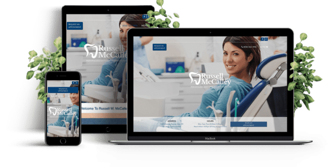
Design Once. Look Perfect Everywhere.
- Mobile-first layouts built for speed, clarity, and engagement.
- Consistent design language across all screen sizes and platforms.
- Optimized for search engines, conversions, and mobile users.


What Is Responsive Website Design?
Responsive Website Design is the process of designing and developing a website that automatically adjusts to any screen size or device. It’s not just about shrinking visuals — it’s about rethinking how content flows. From fluid grids to flexible layouts, we ensure your site looks perfect whether opened on mobile phones, tablets, or desktops.
A well-optimized responsive website improves user experience, reduces load time, and performs better on search engines. It’s a foundation for every modern business that values visibility and performance.
Technologies We Use


Our Responsive Website Design Services
We design responsive websites that adapt beautifully to every screen and device. From layout to performance, each element is fine-tuned to deliver a seamless user experience and measurable business results.
Mobile-First Design Approach
With more users browsing on mobile devices, we prioritize a mobile-first design strategy. Your website will be optimized to look and function flawlessly on any screen size, improving user engagement and conversions.
SEO-Friendly Development
Our responsive web designs are SEO-optimized to ensure higher search engine rankings. Google prioritizes mobile-friendly websites, and we ensure your site meets all technical and on-page SEO guidelines to boost visibility.
Custom Design Solutions
At Touchstone Infotech, we understand that every business is unique. Our team works closely with you to design a website tailored to your brand, industry, and goals, ensuring your website stands out from competitors.
Fluid Grid Layouts
Speed is critical for user experience and SEO. Our responsive designs include optimized images, clean coding, and performance-boosting features to reduce loading time across all devices, ensuring maximum efficiency.
Faster Load Time Optimization
Your visitors won’t wait. We minimize file sizes, compress images, and optimise scripts to ensure fast loading. Quick pages not only improve user experience but also increase conversions.
Cross-Browser & Device Compatibility
We test on multiple browsers and devices, ensuring responsive and adaptive design consistency. Whether viewed on Chrome, Safari, or Edge, your website stays reliable and pixel-perfect.
User-Centric Experience Design
Designing and developing for humans first. Every responsive website we build focuses on intuitive navigation, clean layouts, and easy content interaction for better overall user experience.
Ongoing Support & Maintenance
Our job doesn’t end at launch. We offer continuous updates, performance checks, and improvements to keep your website stable, fast, and compatible with new devices and screen sizes.
Benefits & ROI of Responsive Website Design
A responsive website isn’t just about looks — it’s about performance, visibility, and growth. Our Responsive Website Design Services help you attract more visitors, reduce bounce rates, and turn casual clicks into loyal customers.
Seamless Experience on All Devices
Your site automatically adapts to different screen sizes and resolutions. From mobile phones to large desktops, every visitor enjoys the same smooth experience without pinch, zoom, or scroll issues.
Higher Search Engine Visibility
Google rewards mobile-friendly websites. Our SEO-driven designs improve site ranking, increase organic traffic, and strengthen visibility across search engines through responsive and adaptive design best practices.
Faster Loading Across Devices
Optimized images, minified scripts, and lightweight coding ensure quick load time. Users stay engaged, while your bounce rate drops and conversions rise.
Improved User Engagement
Responsive websites encourage longer visits and more interaction. We design with user behavior in mind, guiding visitors smoothly through content and calls-to-action on all specific devices.
Cost-Effective and Scalable
No need for separate desktop and mobile versions. A single adaptive website saves maintenance costs, simplifies updates, and scales easily as your business grows or adds new screen solutions.
Stronger Conversion Rates
Consistency builds trust. When your website feels intuitive across mobile screens and tablets, visitors are more likely to sign up, buy, or connect with your brand.
Enhanced Brand Perception
A responsive design reflects professionalism. Your audience experiences a modern, reliable, and credible interface that strengthens brand recall and repeat visits.
Long-Term ROI & Growth
With ongoing updates and responsive optimization, your site remains relevant across devices. It supports future technologies and delivers measurable returns over time.
Why Choose Touchstone Infotech for Responsive Website Design
At Touchstone Infotech, we craft responsive websites tailored to your business needs. Our expert team ensures seamless user experiences, driving higher engagement, conversions, and long-term growth for your brand.
Marketing Strategy That Delivers
Before designing, we research your business and competitors to build a website strategy that aligns with your marketing goals and ensures real conversions.
Targeted Design Approach
Every business has unique goals. We design adaptive websites and cloud-integrated solutions that reflect your audience, brand tone, and industry objectives.
Conversion-Optimized Frameworks
The responsive websites we build are tested for engagement. Each page layout, button, and flow is optimized for better user interaction and higher lead conversion.
On-Time Delivery, Every Time
We respect your timelines. Our structured workflow and milestone-based delivery ensure your responsive website launches when planned — without compromising quality.
SEO & Performance Optimization
Competitor analysis shows speed and SEO performance define success. We focus on load time, Core Web Vitals, and structured data for strong search engine visibility.
Post-Launch Support & Maintenance
Our work doesn’t end at delivery. From updates to mobile compatibility checks, we ensure your site keeps performing smoothly across all devices.
Data-Driven Design & Testing
Using analytics, heatmaps, and real-user testing, we refine designs for continuous improvement and higher engagement over time.
Proven Experience & Measurable Results
With 12+ years of experience, 200+ satisfied clients, and 500+ web campaigns, our Responsive Website Design Services have consistently delivered measurable business outcomes.
Our Process
Building Responsive Websites That Perform Everywhere
At Touchstone Infotech, we follow a streamlined, data-led process to design responsive websites that look great and perform flawlessly across devices. From strategy to support, every stage focuses on user experience, faster load time, and measurable growth.
Consultation & Strategy Development
We begin with an in-depth discussion about your goals, audience, and competitors. This helps us plan the responsive layout, screen solutions, and performance targets that match your objectives.
Design & Prototyping
Our designers create adaptive wireframes and mockups optimized for different screen widths. You’ll see how your website adapts across mobile screens, tablets, and desktops before development begins.
Development, Optimization & Testing
We build using fluid grids, flexible layouts, and mobile-first coding. Each version is tested across browsers and specific devices for speed, load time, and responsive behavior.
Launch & Continuous Support
After launch, we monitor real-user data and Core Web Vitals. Our ongoing maintenance ensures your responsive and adaptive design remains fast, stable, and SEO-friendly.
Results That Prove Responsive Design Works
Our Responsive Website Design Services deliver measurable improvements across performance, conversions, and visibility. Every redesign is tracked with analytics, giving you clear proof of ROI. Here’s what clients consistently achieve after upgrading to responsive and adaptive design.
40% Faster Load Time
Optimized code, compressed images, and efficient caching reduce page load time, improving user experience and boosting engagement.
35% Growth in Organic Traffic
Search engines reward mobile-friendly design. Our clients experience noticeable growth in traffic after implementing responsive web design.
50% Higher Conversion Rates
Consistent mobile-first design across devices increases trust and leads to higher sign-ups, purchases, and form submissions.
25% Reduction in Bounce Rate
Better layout flow and smoother navigation keep users engaged longer, reducing bounce rate across all screen sizes.
3x Longer Average Session Duration
Adaptive layouts encourage exploration. Visitors stay longer, consuming more content and interacting more often.
100% Cross-Device Compatibility
Each project is tested across major browsers and specific devices to ensure flawless display and usability everywhere.
Tools & Partnerships
Our Responsive Website Design Services combine powerful tools and trusted partnerships to deliver fast, reliable, and data-backed results. From performance tracking to automation, every integration helps your website stay optimized for search engines and mobile users.
Google Partner Tools
We use PageSpeed Insights, Analytics, and Lighthouse to monitor performance, improve load time, and enhance mobile-first design results. Every site we build meets Google’s responsive design standards.
AWS & Cloudflare Integrations
Fast hosting and global content delivery ensure your site loads quickly anywhere. These integrations strengthen uptime, caching, and security for consistent user experience across devices.
Semrush & Hotjar for Insights
We track behavior, heatmaps, and keyword performance. These insights help us refine responsive layouts, adjust adaptive elements, and boost engagement on mobile screens.
HubSpot & CRM Integrations
We connect your website with HubSpot and other CRMs to automate lead tracking, improve conversions, and streamline communication between forms, analytics, and sales workflows.
Industry Specialization
We design Responsive and Adaptive Websites that fit your business type, customer behavior, and industry goals. Each project is shaped by data, not templates — ensuring mobile users get a seamless, device-ready experience wherever they are.
eCommerce
Mobile-first storefronts that adapt to screen sizes, improve load time, and simplify the buying experience — helping you boost conversions across all mobile devices.
Real Estate
Adaptive property listings with fast loading galleries and responsive filters. Every listing stays accessible and consistent across mobile phones, tablets, and desktops.
Healthcare
Secure, mobile-friendly websites designed for accessibility and trust. We prioritize clean layouts and fast response for patients browsing on specific devices.
Education
Responsive portals for online learning, course browsing, and admissions. We optimize every layout for easy navigation and clear readability on smaller screens.
Hospitality
Mobile-friendly booking and menu layouts built for quick loading and strong visuals. Adaptive layouts ensure a smooth experience for guests booking on the go.
Technology & SaaS
Scalable, responsive designs built for fast updates and integration. We use adaptive frameworks that evolve with your platform and user expectations.
Professional Services
Clean, conversion-led responsive sites that communicate credibility and drive lead generation — designed for performance and clarity on all screen widths.
Nonprofits & NGOs
Optimized donation pages and event sections that work seamlessly across mobile versions, helping your cause reach more supporters and volunteers.


-
 Prashant Rajput
- Local Business Marketing, SEO


Trusted by Businesses, Loved by Clients
Excellent rating
Based on 218 reviews

FAQ
Your Path to Success with Touchstone
Everything You Need to Know About Our Responsive Design Services
It’s a web design method where layouts automatically adapt to any screen size or device, ensuring a consistent user experience without manual resizing or separate mobile versions.
It creates fluid layouts that adjust to screen widths, load faster, and display perfectly on mobile devices, making navigation smoother and engagement stronger.
Adaptive design uses fixed layouts for specific devices, while responsive design adjusts fluidly. We often combine both to improve flexibility, speed, and performance.
Most users browse on mobile phones. Mobile-first design ensures pages load faster, maintain readability, and perform better in search engine results.
Most responsive design projects take between four to six weeks, depending on the page count, integrations, and overall complexity.
Yes, we can. Our team upgrades older websites into fully responsive, mobile-friendly versions without affecting your current SEO or brand structure.
We use WordPress, Shopify, React, Node.js, and more — combining modern frameworks and adaptive components for high performance across all devices.
Yes. Google rewards mobile-friendly websites with better visibility. Responsive and adaptive designs improve speed, structure, and engagement — all vital for SEO.
We test every site on real mobile phones, tablets, and desktops, along with emulators and browsers, to ensure full compatibility and stability.
Yes. We provide updates, content adjustments, and performance checks to keep your responsive website optimized and secure long after launch.
Absolutely. A single responsive design eliminates the need for separate mobile versions, reducing both development and maintenance costs significantly.
You’ll see better search visibility, faster load time, higher engagement, and more conversions as users enjoy a consistent experience on all screens.
More on our Design Services
Partners & Accreditations


